Graphic Design Basics To Get You Started on Creating
In today’s fast-paced digital landscape, graphic design plays a vital role in capturing your audience’s attention and conveying your brand’s messages. Whether you’re a seasoned digital marketer or an entrepreneur, understanding the basics of graphic design can make all the difference in achieving your online marketing goals.
While it’s impossible to cover every tiny detail about design In this article, we will delve into introducing you to and/or increasing your understanding of graphic design, exploring its importance for your brand, the types of designs suitable for digital platforms, the intricacies of colour theory and basic colour schemes, the fundamentals of shape theory, essential font principles, the tools at your disposal, crafting a compelling hierarchy for social media posts, design guidelines, dos and don’ts, and some handy tips and tricks along the way.
What is Graphic Design?
Graphic design is the art of visually communicating ideas, information, and messages through a combination of images/graphics, typography, and layout. It involves creating visually appealing and coherent designs that resonate with your target audience. In the realm of digital marketing, graphic design is a powerful tool for grabbing the attention of online users and conveying your brand’s identity and message.
Why is it Important for Your Brand?
Graphic design is a crucial aspect of your brand’s online presence. It helps you establish a cohesive and memorable visual identity that sets you apart from competitors. Consistent and appealing design elements such as logos, colour schemes, and typography, reinforce your brand’s recognition and credibility. Moreover, well-crafted designs enhance user experience and engagement, ultimately driving conversions and sales.
What Kind of Designs Can You Create for Digital Platforms?
In the digital marketing realm, the scope of graphic design is vast. You can create a variety of designs for different online platforms, including social media, websites, email marketing, and online advertisements. These designs may include eye-catching social media posts, captivating website banners, informative infographics, and enticing email templates. Each design type serves a unique purpose in your digital marketing strategy, catering to specific audiences and platforms.
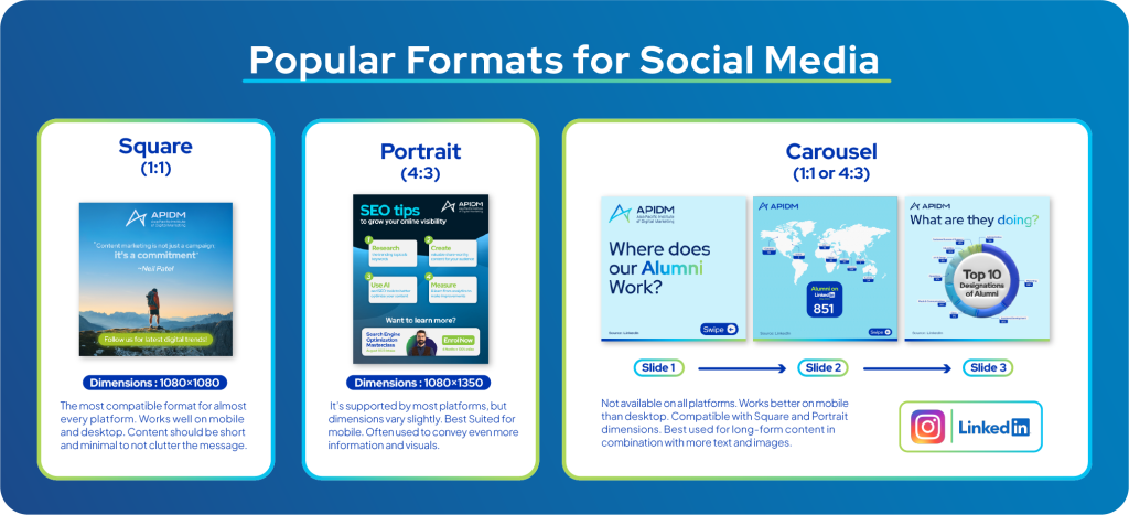
In terms of social media, the most popular formats are Square, Portrait and Carousel.
Let’s get started with the Basics of Graphic Design…
What is Colour Theory?
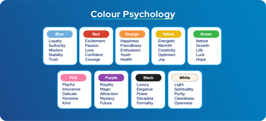
Colour theory is the science and art of using colours effectively in design. Colours evoke emotions and convey messages, making them a critical component of graphic design. By understanding colour psychology, you can choose hues that resonate with your brand and target audience, creating visually appealing and emotionally engaging designs. Make sure to stick to a consistent and minimal palette of colours for your brand.
What are Some Basic Colour Schemes?
When selecting colours, it’s important to maintain visual harmony in your designs. It’s essential to grasp basic colour schemes. These include monochromatic, complementary, analogous, and Split complementary colour schemes among the most popular. Utilizing these schemes strategically can help you create designs that are aesthetically pleasing and easy on the eyes, and match the values of your brand and audience.
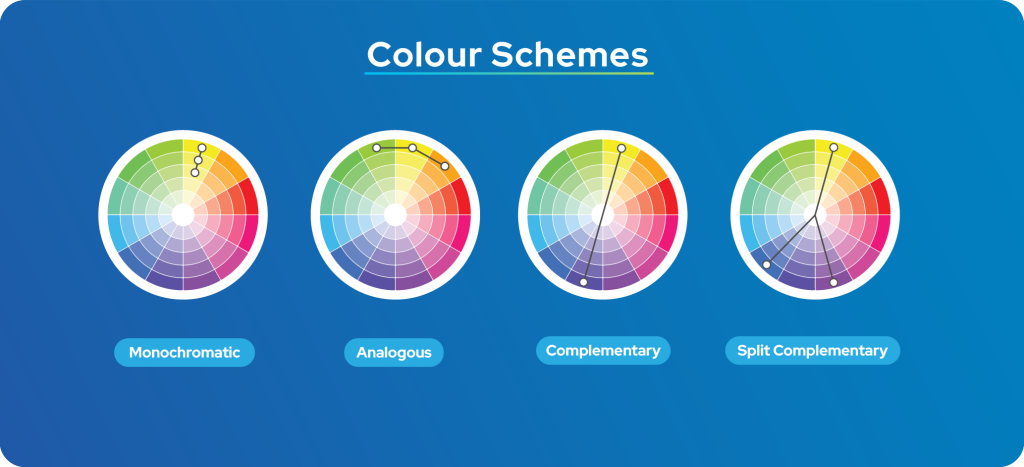
- Monochromatic: A monochromatic colour scheme is a design or colour palette based on varying shades and tones of a single colour. This creates a harmonious and elegant look, as all colours originate from one hue, making it easy to achieve a balanced design.
- Analogous: An analogous colour scheme is a versatile choice, selecting adjacent colours for a harmonious effect. It’s ideal for balance, evoking emotions or themes. For instance, warm analogous colours like red, orange, and yellow bring energy, while cooler ones like blue, green, and teal offer a calming atmosphere in your design.
- Complementary: A complementary colour scheme pairs colours from opposite sides of the colour wheel, creating a strong contrast. This approach is often used in design to make eye-catching compositions, especially in advertising, branding, and creating focal points in various projects.
- Split Complementary: A split complementary colour scheme pairs a base colour with two neighbouring colours on the colour wheel, creating a visually interesting palette that balances contrast and harmony. Designers use it to add depth and interest to their projects, thanks to its versatility and ability to maintain a pleasing colour balance. This colour scheme can be slightly challenging to implement in designs, it requires some research and needs to be experimented with.
Always ensure that there is good contrast between colours to ensure that your content remains legible for the viewer. Even more colour schemes exist in design, such as Triad, Tetrad and Square, feel free to research and learn more about them.
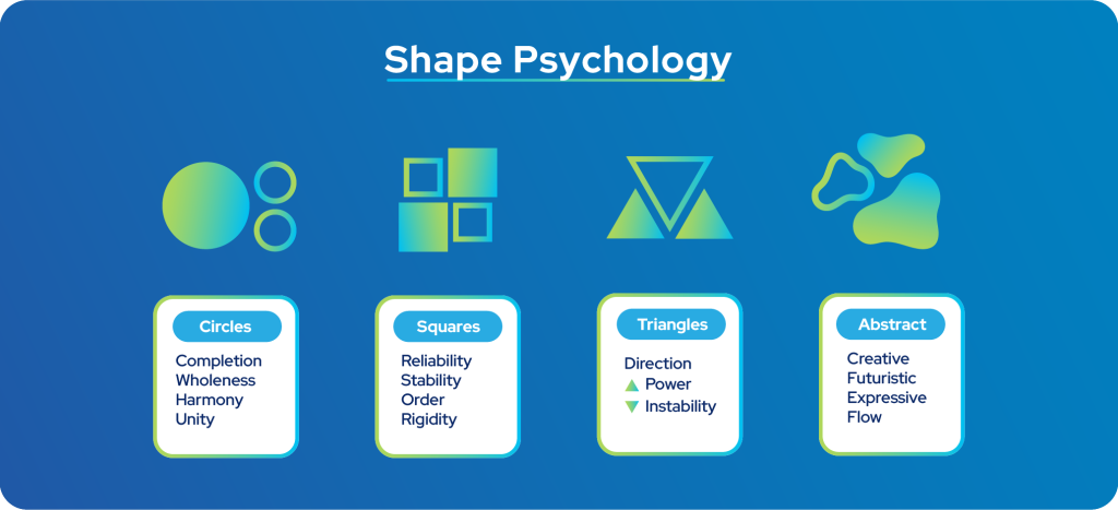
What is Shape Theory in Graphic Design?
Shapes are fundamental elements in graphic design. They can convey meanings, emotions, and messages or at the very least add a visually interesting element to your design. Whether it’s using circles for inclusivity or triangles for dynamism, the choice of shapes should complement your design goals. Familiarising yourself with shape theory allows you to select shapes that align with your brand’s identity and the content you wish to convey. It is best to stick to one shape type, but always avoid using more than two types of shapes in your designs.
The Basics of Typography for Graphic Design
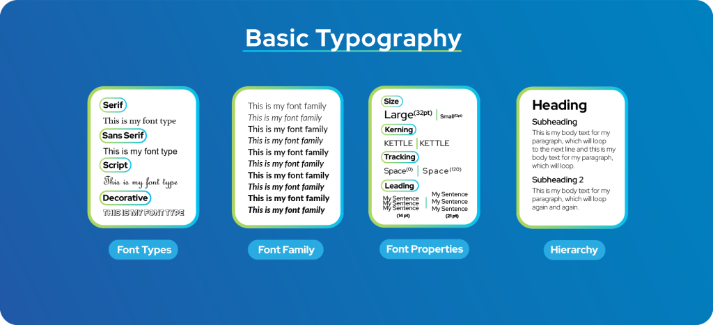
Typography is a vital aspect of graphic design. Fonts convey tone, personality, and readability. Consider factors such as font style, size, and spacing to ensure your text is both visually appealing and easy to comprehend. Striking the right balance between aesthetics and readability is crucial for effective communication. Always stick to a consistent and minimal selection of fonts to maintain consistency in your brand, a selection of no more than 3 fonts is best.
Font Types
- Serif Font: Serif fonts have small lines at the ends of letters. They’re classic and work well for formal contexts like books, newspapers, and branding. These fonts convey a sense of traditionalism and old-fashion-ness.
- Sans Serif Font: Sans Serif fonts are clean and modern, great for digital platforms like websites and apps. Most new and future-focused brands use these fonts.
- Script Font: Script fonts mimic handwriting, adding elegance to items like invitations and menus.
- Decorative Font: Decorative fonts offer a wide range of styles, perfect for creative projects like posters and logos.
Script and Decorative fonts are often only used for titles and emphasis, especially to add style and visual interest to a design.
Font Family and Hierarchy
A font family consists of a group of related typefaces that share similar design features. This includes styles like regular, bold, and italic. We can use font families to maintain a consistent visual theme while adapting it to different parts of a project, like using bold for headings and regular for body text.
Font Properties
- Font Sizes: Font size refers to how big or small text appears on your design. Smaller sizes are used for regular text, while larger ones are for headings and emphasis. Choosing the right size is important for readability and design hierarchy.
- Kerning: Kerning means adjusting the space between individual letters to make them look balanced. It’s crucial in logos, headlines, and display text to ensure letters sit well together.
- Tracking: Tracking, or letter spacing, adjusts the space between all characters in a block of text. It affects how dense the text looks. You can increase it for better readability in big blocks of text or decrease it for a compact look.
- Leading: Leading is the vertical space between lines of text, also referred to as ‘line spacing’. It impacts how easy it is to read. Proper leading ensures your sentences aren’t too crowded or spread out, improving overall readability and design.
This is the foundation upon which typography is built upon.
Now that you Understand the Basics of Graphic Design, Let’s Create Something…
What Tools Can You Use for Graphic Design?
The digital age has brought forth a plethora of tools and software for graphic design. Adobe Creative Cloud, including Photoshop, Illustrator, and InDesign, remains the industry standard. But they require a paid subscription and have a steep learning curve for new users.
However, there are more user-friendly and some free alternatives like Canva and Figma that cater to varying skill levels and needs. Choosing the right tool depends on your objectives and familiarity with the software.
Where can I get Resources such as Images and Colour Palettes?
There are many free online sources for almost everything in your design journey. I will list a few of them below.
- Colours and creating palettes: https://color.adobe.com/
- Stock Images and Videos: https://www.pexels.com/
- Design Templates and assets (Graphics, Images and more): https://www.freepik.com/
Always use sites like Pinterest, Facebook, Instagram and even Google to get inspiration before you start designing.
Basic Layouts for a Social Media Post
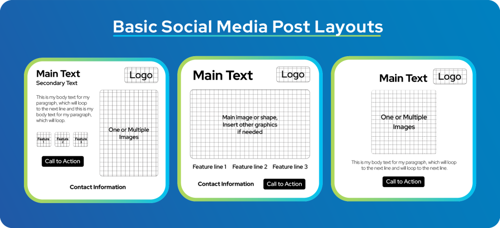
When crafting social media posts, it’s essential to establish a clear visual hierarchy. This involves organising content elements such as headlines, images, and call to action in a way that guides the viewer’s eye and emphasises the most critical information. Effective hierarchy ensures that your message is conveyed quickly and effectively, even in a fast-scrolling social media feed.
The following are some layouts that you can follow when creating your posts for social media. You can add or remove these elements to suit your needs, just remember to ensure that you get your message through while keeping your viewers engaged.
Dos and Don’ts in Graphic Design
Do:
- • Adhere to certain guidelines, such as the ones mentioned in this article, this is paramount while maintaining a healthy dose of creativity.
- • Maintain consistency in branding elements.
- • Ensure readability through good clarity.
- • Use relevant and high-quality images for your designs.
Consistency fosters brand recognition and readability ensures your message is understood.
Don’t:
- • Create designs with low contrast.
- • Use cluttered layouts or excessive use of trendy but distracting elements
- • Neglect mobile users when designing.
Overly complex designs can overwhelm viewers, and distract them from your message, and failing to cater to mobile users can lead to missed opportunities.
Tips and Tricks for Improving Your Graphic Design Skills
Now that you’ve learned the basics of graphic design, you can confidently start experimenting and improving your craft. To excel in graphic design for digital marketing, keep these tips and tricks in mind:
- • Continuously learn and update yourself with the latest design trends and techniques.
- • Regularly update your designs to stay relevant and engaging.
- • A/B test different design elements(Texts, Images, Layouts) to optimise performance of posts.
- • Seek feedback from peers and your target audience for continuous improvement.
Conclusion
Graphic design is a dynamic and essential component of digital marketing. Mastering its principles, utilising the right tools and ensuring your message is conveyed to the right audience, allowing you to grow your online presence. If you’re interested in learning how to build your business online, running ad campaigns to get more customers and sales, promoting and establishing your brand online and so much more in the field of Digital Marketing, do check out our very own Digital Marketing Programs suited for everyone from complete beginners to experienced professionals.