Data Visualization with Power BI
to inductry level

Boost your data visualization skills with the Power BI Short Course! In just 3 weeks, you'll master the art of connecting and presenting data using Power BI. Dive into interactive reporting and dashboard creation, and unlock the full potential of this powerful business intelligence tool. By the end of the course, you'll confidently make informed decisions and drive impactful outcomes within your organization. Join us now and take your data-driven decision-making abilities to the next level!
Learning Outcomes
Develop a solid grasp of Power BI's core concepts.
Create visually appealing and interactive reports and dashboards.
Transform data and create efficient data models for analysis.
Learn techniques to analyze and explore data to derive meaningful insights.
Streamline your data analysis and reporting processes.
Collaborate effectively by utilizing Power BI's collaboration features.
Who is this program for?
This program is ideal for any professionals who already possess a basic understanding of data analysis and are eager to enhance their skills in data visualization and business intelligence.

APIDM has partnered with Credly, the global leader in digital credential solutions, to provide you with a digital version of your Data Visualization with Power BI Program credential that you can use to showcase what you've accomplished.
Program Outline
Lesson 1 Introduction to Analytics and Power BI
Lesson 2 Use PBI Desktop to Create Reports and Dashboards
Lesson 3 Prepare Your Data Efficiently for Analysis (In MS Excel /Power BI)
Lesson 4 Use Power Query to Transform Your Data (In MS Excel /Power BI)
Lesson 5 Analyzing Data with Multiple Data Tables
Lesson 6 Use Advanced Calculations with DAX Formulas
Lesson 7 Create Dashboards for Maximum Impact
Lesson 8 Share Your Data Analysis using Power BI
Tools you'll be familiar with


90% of senior executives believe that data visualization is a crucial factor in making effective business decisions.
HubSpot
The average data professional spends 20% of their time on data visualization. The global data visualization market is expected to reach a value of over $11 billion by 2025, driven by the increasing adoption of data-driven decision-making and the need for organizations to communicate insights effectively.
What Our Alumni Say
-

"As someone from a traditional advertising background, my goal was to expand my skills in digital marketing. The instructors were experienced digital marketers, ensuring that I was getting the best value for my investment.”
Amrik Daryanani
Marketing Research Analyst
-

"I chose APIDM for my digital marketing needs because they offer the most comprehensive and recognized program. I highly recommend APIDM because of its knowledgeable faculty, practical approach, and ongoing updates to reflect industry changes."
Charitha Dias
Product Manager
-

"I wanted to share my experience with APIDM:I took their course to enhance my digital marketing skills. It made a huge difference in the way I engage with my team and approach content creation."
Anojan Perinparajah
Category Manager
-

“APIDM has truly been a game-changer for me during the pandemic.It was 100% online, there was a lot of interaction and engagement with the trainers and fellow learners.”
Prageeth Wimalarathne
Creative Director
-

"The community of like-minded individuals I found through APIDM has been invaluable, providing support, inspiration, and networking opportunities. It is a transformative experience that will take your marketing skills to the next level."
Rashain Salgado
Founder & Creative Director
APIDM Certified professionals work for


Program Trainer

Mahesh Wickramarachchi
Experienced Data Science Professional
Mahesh is a data analytics expert with extensive experience spanning six years across diverse business domains such as manufacturing, human resources, banking, and finance. He held responsible positions at major conglomerates in Sri Lanka, including MAS Holdings, Dialog Finance, and DFCC Bank Group, where he gained expertise in data warehousing, visualization, predictive analytics, organizational strategy, and analytics education through participation in key projects. Currently pursuing a PhD in Advanced Manufacturing Technology Ecosystems at the University of South Australia.
Panel of Trainers
Frequently Asked Questions
The duration for the Data Visualization with Power BI Program is 3 weeks including the time allocation for the final assessment.
Yes. We recommend this program to anyone who has a basic understanding of data analytics. However, anyone who wants to learn Data Visualization with Power BI from basic to advanced can join the program.
Yes. There will be a comprehensive assessment at the end of the course to evaluate the learning progress of students.
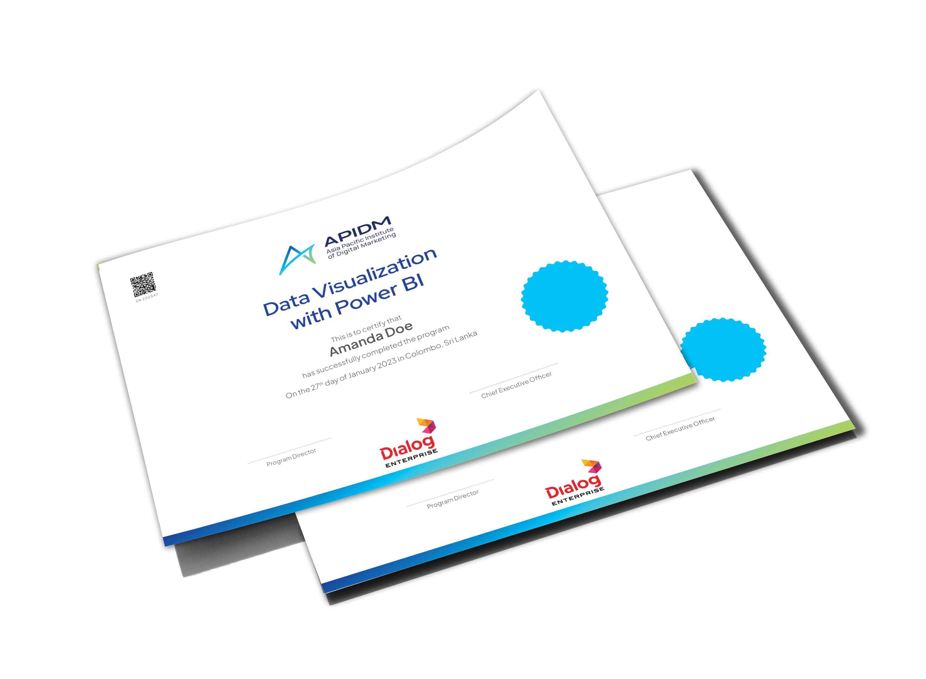
Yes. You will receive a printed certificate upon the successful completion of the program. Further, you will also be awarded an APIDM Qualified Digital Badge which will allow you to easily share on LinkedIn and other public platforms as a verification of your qualification.

Contact Darren
+94 771 775 763